Saturday, July 24, 2010

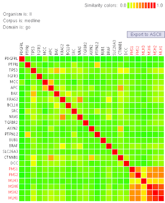
Similarity Matrix

Similarity Matrix


http://tomcat.esat.kuleuven.be/txtgate/tutorial.jsp

A similarity matrix measure pairwise similarities of objects. The greater similarity between the two examined objects, the greater the value of the measure in the matrix.

Star Plot

Star Plot


http://www.answers.com/topic/spider-plot

A Star Plot is a method of displaying multivariate data. Each star represents a one, individual observation. Star plots are usually generated in a multivariate format with numerous stars on each page and each star continuously displaying one observation.

Stem and Leaf Plot

Stem and Leaf Plot


http://mainland.cctt.org/mathsummer/JosephBond/StemAndPlots/stem-and-leaf_std.htm

Stem-and-leaf plots show the frequency with which certain classes of values occur. You could use a stem-and-leaf plot and let the graph show the numbers themselves rather than using another form of graph.

Box Plot

Box Plot


http://www.itl.nist.gov/div898/handbook/eda/section3/boxplot.htm

A Box Plot is a diagram depicting a set of ranked numerical data. A box represents the range of numbers. Lines, also know as whisker, project from the box to represent the maximum and minimum values.

Histogram

Histogram

http://www.mar.dfo-mpo.gc.ca/science/acon/Examples/HistogramExample.html

A Histogram is essentially a bar chart. It represents frequency distribution, where heights of the bars represent observed frequencies.

Parallel Coordinate Graph

Parallel Coordinate Graph


http://www.stat.columbia.edu/~cook/movabletype/archives/2007/10/parallel_coordi.html

A Parallel Coordinate Graph puts each plot on a vertical axis and connects them to form a graph.

Triangular Plot

Triangular Plot


http://ex-parrot.com/~chris/wwwitter/20050407-it_doesnt_matter_how_you_vote_either_way_your_planet_is_doomed.html

A Triangular plot is a graph of 3 variables. It is most often used in geologic studies,but it can be applied to any system of 3 variables to represent data.

Windrose

Windrose


http://www.britannica.com/EBchecked/topic/645082/wind-rose

A Windrose is a map that summarizes information about the wind at a certain location over a certain length of time.

Climograph

Climograph


http://www.uwsp.edu/geo/faculty/lemke/geog101/lecture_outlines/09_global_climate_patterns.html

A Climograph map is a graphical representation of the basic average temperature and precipitation at a specific location. This is a Climograph of Walgett, Australia.

Population Profile

Population Profile


http://www.ifad.org/operations/regional/pf/aids_1.htm

Population Profile is a a chart showing the number of people as a function of their ages that are related to a specific are of study. This is a chart with people diagnosed with AIDS.


Scatterplot

Scatterplot

http://www.mzandee.net/~zandee/statistiek/stat-online/chapter4/pearson.html


A scatterplot is a useful summary of a set of two variables. It gives a good visual representation of the relationship between the two variables. This Scatterplot depicts the age differences between men and women that are married.

Index Value Plots

Index Value Plots


http://waterwatch.usgs.gov/?m=pa07d&w=plot


An Index Value Plot map is a type of visualization map where data is represented on a line graph.

Lorenz Curve

Lorenz Curve


http://www.answers.com/topic/lorenz-curve

A Lorenz Curve is a cumulative frequency curve showing the distribution of a variable such as population against an independent variable such as income or area settled.


Nominal Area Choropleth Map

Nominal Area Choropleth Map


http://www.sptimes.com/election2000/map.shtml

Nominal Area Choropleth Maps represent numbers in the map and displays nominal data. The first thing that came to mind for me was the electoral college. This a
Nominal Area Choropleth Map of the 2000 election.


Unstandardized Choropleth Maps

Unstandardized Choropleth Maps


http://www.uwec.edu/webprojects/geog367/northwoods/Canoeing/Colneycm_Finished/SKI_MAP.jpg

Unstandardized Choropleth Maps represent raw data in no particular order. There is no importance in rank, number, size, etc.

Standardized Choropleth Maps

Standardized Choropleth Maps


http://pubs.usgs.gov/tm/tm11c2/

Standardized Choropleth Maps allow for comparison of data along different geographical areas. The top image is a Standardized Choropleth Map of the census of Astoria, Oregon.

Univariate Choropleth Maps

Univariate Choropleth Maps


Univariate Choropleth Maps is the singular version of Bivariate mapping, meaning it only maps one set of data.

Bivariate Choropleth Maps

Bivariate Choropleth Maps


http://proceedings.esri.com/library/userconf/proc99/proceed/papers/pap171/p171.htm

Given a set of geographic features, Bivariate Choropleth Maps map two variables on a single map. This is a Bivariate Choropleth Map of median house values in the counties of Ohio.

Unclassed Choropleth Maps

Unclassed Choropleth Maps


http://www.esri.com/news/arcuser/1003/files/choropleth.pdf

Unclassed Choropleth Maps do not have classes, instead it uses a frequency curve that varies the shading from the lowest to the highest. This is an Unclassed Choropleth Maps of the previous blog.

Classed Choropleth Maps

Classed Choropleth Maps


http://www.esri.com/news/arcuser/1003/files/choropleth.pdf

In Classed Choropleth Maps, the main purpose is to determine the height and shading or color intensity of each individual bar. This is a Classed Choropleth Map of divorce rates in the USA.

Monday, July 5, 2010

Range Graded Proportional Circle Map

Range Graded Proportional Circle Map


http://www.neiu.edu/~ejhowens/377/examples.htm

This proportional circle map uses ranges to depict the values of each circle. This is a map of the Filipino population in relation to where they live in the US.

Continuously Variable Proportional Circle Map

Continuously Variable Proportional Circle Map


http://www.lib.utexas.edu/maps/europe/west_germany_ind_1972.jpg

This type of map uses proportional circles over areas to depict measurements. The size of the circles are proportional to the data being measured.

DOQQ

DOQQ


http://www.usgsquads.com/prod_doqq.htm

A digital orthophoto quadrangle (DOQQ) is a computer-generated image of an aerial photograph. It combines the image characteristics of a photograph with the geometric qualities of a map.

DEM

DEM


http://www.emporia.edu/earthsci/student/alvarez1/551proj.html

A DEM is a digital map of the elevation of an area on the earth. This is a DEM of Sacramento Valley.

DLG

DLG


http://edc.usgs.gov/products/map/drg.html

A DLG is a digital line graph that depicts geologic features. This is a DLG that depicts a variety of information including, border, water, and transportation information for the state of Tennessee.

DRG

DRG


http://www.tceq.state.tx.us/gis/drg.html

Digital Raster Graphics (DRGs) are scanned images of U.S. Geological Survey (USGS) topographic maps. The image represented inside the map neatline is georeferenced to the surface of the earth. This makes it possible to use DRG as a map layer in many GIS software packages.

Isopach

Isopach


http://seeps.geol.ucsb.edu/pages/isopach.html

Isopachs are maps of the areal extent and thickness variation of a stratigraphic unit. It is often used in the exploration for oil. This is a Isopach Map of Holocene Overburden.

Isohyets

Isohyets


http://www.scoop.co.nz/stories/AK0808/S00090.htm

Isohyets are lines drawn on a weather map connecting points that receive equal amounts of precipitation during a given period of time. This isohyet was released by the Taranaki Regional Council.

Isotachs

Isotachs


http://www.atmos.washington.edu/~mcmurdie/oct96/oct96_labs.html

Isotachs are lines along which the speed of the wind is constant and consistent. Isotachs are generally represented on surfaces of constant elevation or atmospheric pressure.

Isobar

Isobar


http://www.newmediastudio.org/DataDiscovery/Hurr_ED_Center/Hurr_Structure_Energetics/Closed_Isobars/Closed_Isobars.html

Isobars are lines of equal atmospheric pressure drawn on a meteorological map. Each line passes through a pressure of a given value. This is an example of closed isobars around a low pressure cell.

LIDAR

LIDAR


http://www.csc.noaa.gov/products/sccoasts/html/tutlid.htm

LIDAR is an acronym for Light Detection And Ranging. It can measure distance, speed, rotation, chemical composition, and concentration of a remote target where the target can be a clearly defined. It can also locate or a diffused object such as a smoke plume or clouds. This is a LIDAR image collecting topographic data on the coast of South Carolina.

Doppler Radar

Doppler Radar


http://www.weatherusa.net/blog/index.php?month=August_2004

Doppler Radar is a weather radar system that employs the apparent shift in frequency of radio waves to perceive air motion. This enables it to predict tornadoes, hurricanes, and precipitation sooner than previous radars. Additionally, it provides information on the speed and direction of rain and ice. This is a Doppler Radar image of Hurricane Frances hitting Florida.

Black & White Aerial Photo

Black & White Aerial Photo


http://www.fas.org/irp/imint/docs/rst/Sect21/Examq21.html

Black and white aerial photography is used along with color infrared films today. It is still used in both high and low altitude aerial photography. This is a black and white aerial photo of Bloomsburg, Pennsylvania.

Infrared Aerial Photo

Infrared Aerial Photo


http://www.aerialarchives.com/Infrared-Aerial-Photography.htm

Infrared aerial photography can be used to document changes to the environment, the health of forests, wetlands, bays and oceans, etc. It can also be used to document and monitor such items as damage to roofs. This is a photo of Sacramento River Deep Water Ship Channel and Levees.

Cartographic Animations

Cartographic animations


http://libraries.maine.edu/Spatial/gisweb/spatdb/gis-lis/gi94078.html

In cartography, animation is usually defined as the depiction of change through time. It is the illusion of movement in a map. This is an animation that depicts the change in the percent of population over 65 in the United States.