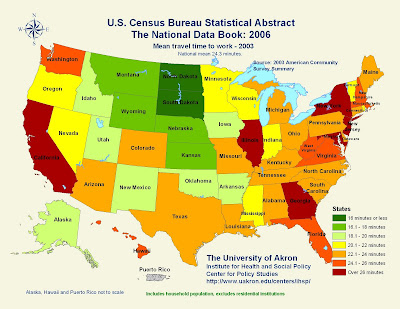
A statistical map is a map in which the differences in quantity of a subject is represented according to a specific geographic area. This a statistical map of the mean travel time to work per state.

A cartogram is a map in which some mapping variable is substituted for land area, causing the space of the map to become distorted in order to portray the information of this variable. This is a cartogram of the world population per country.
Proportional Circle Maps

Choropleth Maps

http://my.ilstu.edu/~jrcarter/Geo204/Choro/Tom/
A choropleth map is a thematic map in which areas are shaded or patterned in proportion to the measurement of the statistical variable being displayed on the map. This is a choropleth map of the Hispanic population by county in the state of Florida.

A Dot Distribution Map is defined as a map type that uses a dot symbol to show the presence of a feature. Dot maps rely on a visual scatter to show spatial pattern. They are often used in depicting the populous, as seen with this map of the 2000 population distribution of the United States.

Propaganda maps are maps that are often used by the government. The issue isn’t the scale, or accuracy of distance measurements, the issue is the map is being used to sew fear and produce a desired effect in the populous. They are often used during times of war, as this map shows the “The World According to Ronald Reagan” during the Cold War.
Hypsometric Maps

In topographic surveying, Hypsometric maps represent the elevation of the terrain with colors. The area between two neighboring contour lines receives one specific tint, sometimes by means of shading, tinting, or batching. This map depicts the dry vegetation of Egypt.

http://www.fairview-industries.com/standardmodule/mn-exmpl.htm
The Public Land Survey System (PLSS) is a way of subdividing and describing land in the United States. All lands in the public domain are subject to subdivision by this rectangular system of surveys, which is regulated by the U.S. Department of the Interior. This is a PLSS map of Minnesota.